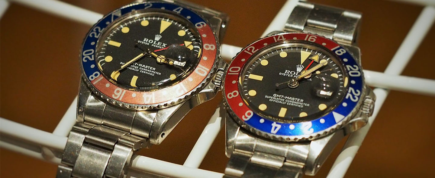
1675 is the first reference that aroused my attention in Vintage Rolex. I was influenced by it shortly after i started searching for VR. The inserts fading to different hues from one another and the tritium indexes taking different colors of patina; forming a great rustic blazonry package all together which has a hypnotizing charm.
It took a while for me to find the exact Gmt Master in the desired condition. I kept my first 1675 for a little while which had off-white plots, slightly faded insert and 3.3 mil. serial number (1972) with a mk-2 matte dial. Also the colorful face of the watch makes it easier to match it with leather straps, so i had the chance to wear it in different combinations.
The imperfection of the polishing work on the case started to bother me after sometime purchasing the watch which i didn’t focus much at the time of getting it because of my growing impatience to use the watch. I ended up replacing it with another 1675 which had a better detailing work done in the past with thicker case and even lugs.
The second addition Mk-5 matte dial 1675 is still in my collection and it has deep yellow patina on the tritium indexes with a non-faded insert which is showing amazingly vibrant colors.
Even though the second example i acquired is in pleasing condition, i had to purchased another 1972 Mk-2 dial which had a true unpolished case and it was in the exact desired condition i was looking for my collection. It took a while for me to come by this example. It was produced at the same year as my first 1675 but it shows the exact design features of the 70’s case details ’’chamfers’’ with the perfect dial and matching hands.
Let’s take a close look at the parameters of the most colorful two pieces of my collection. One is produced 7 years later than the other and featuring small difference in details. Both examples have the 1575 caliber and comes with the white print matte-dial which was used throughout the 70’s for the 1675s. The oyster case comes with a 25-116 cyclops plexi glass which has 50 meters (165 feet) water resistance.
The one produced in 1972 with the mark-2 dial has a 3.2 mil. serial on the case. It has the red-back fat font insert and the 7836 folded link bracelet as we can see on most of the earlier 1675s. Some of the major differences compared to the other model is the wider detailed lines on the lugs, dial configuration and the earlier band.
The other one with the 5.9 mil. serial is one of the latest productions of the matte-dial 1675s which has the mark-5 dial. It is also featuring the red-back fat font insert. It has the newer 78360 - Oyster band as can be found on the mid/late 70’s examples. Both the 7836/78360 bracelets don’t have the divers extention and flip-lock features which 9315/93150 Submariner bracelets have. Also it has thinner detailed lines on the lugs ’’bevels’’ compared to the early 70’s models.
It is a great daily wearer for those who like to have many colors on their watches. The blue - red representing the night & day has a retro look. It is frequently used by it’s owners in the warm seasons as we tend to combine many colors in spring and summer periods to express the happy moods that the warm weather works through us. Also it is know as a preferential basic model for the beginner VR collectors.


